
Box Shadow Generator: Create Custom CSS Shadows Online
In the realm of modern frontend development and UI/UX design, depth and hierarchy are what separate a flat, lifeless webpage from a stunning, interactive application. The secret to achieving this realistic depth lies in mastering the CSS box-shadow property. However, manually calculating the horizontal offset, vertical offset, blur radius, and spread radius can be an incredibly tedious and frustrating process. This is exactly where a powerful Box Shadow Generator becomes your ultimate productivity tool.
Whether you are building a sleek SaaS dashboard, designing a neumorphic mobile app interface, or simply trying to make your WordPress blog cards pop, our free CSS Box Shadow Generator allows you to visually design and instantly generate perfect CSS code. In this comprehensive, EEAT-optimized guide, we will dive deep into the mechanics of CSS shadows, explore advanced use cases, and show you how to leverage our Online Box Shadow Generator to elevate your web design to the next level.
📑 Table of Contents
- What Is CSS Box Shadow?
- Why Use Box Shadow in Modern Web Design?
- Understanding Box Shadow Syntax
- Explore Every Feature of Our Tool
- How to Generate CSS Box Shadow (Step-by-Step)
- Real-World Use Cases & Framework Integration
- Comprehensive Comparison Tables
- Best Practices, Performance, and Accessibility
- Frequently Asked Questions
- Final Thoughts
What Is CSS Box Shadow?
Introduced in CSS3, the box-shadow property is a foundational styling rule that allows developers to add shadow effects around the frame of almost any HTML element. Before CSS3, creating drop shadows required slicing images in Photoshop, saving them as PNGs, and using complex background-image sprites. Today, a Free Box Shadow Generator allows you to achieve the same—and far superior—results using pure, lightweight code.
According to the MDN Web Docs, the box-shadow property applies a shadow effect to the element’s bounding box. It respects the element’s border-radius, meaning if you have a circular button or a rounded card, the shadow will perfectly contour the shape. This mathematical precision is why a dedicated CSS Shadow Generator is a staple in every frontend developer’s toolkit.
Why Use Box Shadow in Modern Web Design?
Why should you invest time in generating custom CSS shadows? The answer lies in visual psychology and user experience (UX).
- Establish Visual Hierarchy: Shadows dictate what is “above” or “below” other elements. A heavily shadowed modal appears to float above the page, demanding the user’s immediate attention.
- Enhance Interactivity: By changing the shadow on hover or active states, you provide immediate tactile feedback. A button that “presses in” (using an inset shadow) feels physically responsive.
- Support Modern Design Trends: From Google’s Material Design (which uses precise elevation levels) to the trendy Neumorphism (soft UI) and Glassmorphism (frosted glass), all of these rely heavily on complex, multi-layered shadows.
- Improve Readability: Subtle shadows behind text or cards can separate them from busy backgrounds, drastically improving legibility and user comfort.
When designing a landing page, you might use a Box Shadow Generator to create stunning hero section elements. But don’t forget that a beautiful UI must be backed by solid SEO. Ensure your page URLs are clean by using a Permalink Generator, and read our detailed Permalink Generator Guide for more SEO tips.
Understanding Box Shadow Syntax
To truly master the HTML Box Shadow Generator tools, you must understand the underlying CSS syntax. The standard declaration looks like this:
📋 CSS Syntax:
box-shadow: [offset-x] [offset-y] [blur-radius] [spread-radius] [color] [inset];
Let’s break down every single parameter in detail:
1. Horizontal Offset (offset-x)
This required value dictates how far the shadow is pushed to the left or right. A positive value (e.g., 10px) pushes the shadow to the right. A negative value (e.g., -10px) pushes it to the left.
2. Vertical Offset (offset-y)
This required value dictates the vertical position. A positive value (e.g., 10px) pushes the shadow below the element. A negative value pushes it above. In physical design, light usually comes from the top, so a positive Y-offset is the most natural.
3. Blur Radius
This optional value determines how soft or harsh the shadow is. The default is 0 (a crisp, hard edge). The larger the number, the more blurred and larger the shadow becomes. This is where a CSS Effects Generator shines, allowing you to visually tweak the blur until it looks perfect.
4. Spread Radius
This optional value expands or contracts the size of the shadow itself. A positive value (e.g., 5px) makes the shadow larger than the element. A negative value (e.g., -5px) shrinks it. This is heavily used in Neumorphic design.
5. Color (RGBA, HEX, HSLA)
You can use any valid CSS color format. However, professional developers almost exclusively use RGBA or HSLA. Why? Because the Alpha channel (opacity) allows you to create subtle, realistic shadows that blend beautifully with any background color, unlike solid HEX colors which can look harsh and artificial.
6. Inset Shadow
By default, shadows are cast outward (outset). By adding the inset keyword at the beginning or end of the declaration, the shadow is drawn inside the element’s border, creating an engraved or pressed effect.
7. Multiple Shadows
One of the most powerful features of CSS is the ability to stack multiple shadows. You simply separate each shadow definition with a comma. The browser renders them from front to back (the first declared shadow is on top). This is essential for creating realistic, complex lighting effects.
Explore Every Feature of Our Neksio Tool
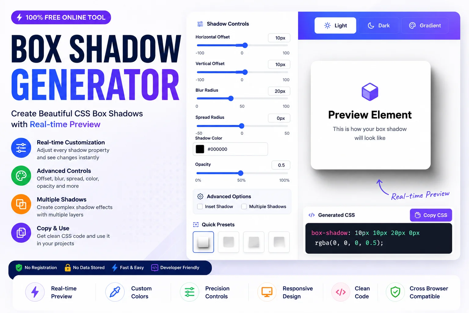
The Neksio Box Shadow Generator is engineered to bridge the gap between design intuition and frontend code. Here is a deep dive into every feature:
- Live Preview: See your changes in real-time. No more guessing what
25pxof blur looks like; the canvas updates instantly. - Light, Dark & Gradient Themes: Shadows look vastly different depending on the background. Our tool lets you toggle between Light, Dark, and Gradient backgrounds to ensure your shadow looks perfect in any context.
- Horizontal & Vertical Sliders: Precision control over the X and Y offsets. Watch the shadow move around your element smoothly.
- Blur & Spread Radius Controls: Dedicated sliders for softening the edges and expanding the shadow’s footprint.
- Color Picker & Opacity Control: A native color picker integrated with an alpha (opacity) slider, making it incredibly easy to generate the perfect RGBA value.
- Inset Shadow Toggle: A simple checkbox to instantly switch between outer drop shadows and inner inset shadows.
- Multiple Shadows Support: Add up to 4 distinct shadow layers to create complex, Material Design-style elevations.
- Ready CSS Code: The tool automatically generates the exact CSS syntax, including vendor prefixes if necessary.
- One-Click Copy Button: Instantly copy the generated code to your clipboard and paste it into your VS Code or IDE.
- Responsive Interface: Whether you are coding on a 4K monitor or tweaking styles on an iPad, the tool’s UI adapts flawlessly.
How to Generate CSS Box Shadow (Step-by-Step)
Creating the perfect shadow takes less than 30 seconds. Follow this simple workflow:
Step 1: Adjust Horizontal Offset
Use the X-axis slider to move the shadow left or right. For a natural top-down light source, keep this near 0 or slightly positive.
Step 2: Adjust Vertical Offset
Use the Y-axis slider to push the shadow down. A value between 10px and 20px usually creates a nice “floating” effect.
Step 3: Set Blur Radius
Increase the blur to soften the shadow. A high blur (e.g., 30px+) creates a modern, airy feel, while a low blur creates a sharp, retro look.
Step 4: Choose Spread Radius
Leave this at 0 for standard shadows. Increase it slightly if you want the shadow to feel more solid, or use a negative value for inset effects.
Step 5: Select Shadow Color
Click the color picker. Instead of pure black (#000000), choose a dark shade of your background’s complementary color (e.g., dark blue for a light gray background) for a richer, more vibrant shadow.
Step 6: Adjust Opacity
Lower the opacity to around 10% - 20%. Subtle shadows are the hallmark of professional UI design.
Step 7: Enable Inset Shadow (Optional)
Check the “Inset” box if you are designing a pressed button or an input field.
Step 8: Copy CSS
Click the “Copy CSS” button and paste it directly into your stylesheet. If you are working with complex data strings or base64 images alongside your CSS, a Base64 Encoder Decoder Online or a Byte Converter can help you manage your asset sizes efficiently.
Real-World Use Cases & Framework Integration
The versatility of a Box Shadow CSS generator means it can be applied to virtually any UI component. Let’s explore how to use these shadows across different elements and frameworks.
1. Cards & Pricing Tables
Cards are the backbone of modern web layout. A subtle shadow lifts the card off the background. For pricing tables, use a heavier shadow on the “Recommended” tier to draw the user’s eye.
“`css .pricing-card { box-shadow: 0 20px 25px -5px rgba(0, 0, 0, 0.1), 0 10px 10px -5px rgba(0, 0, 0, 0.04); } “`2. Buttons & Forms
Buttons use shadows to indicate clickability. On the :active state, switch to an inset shadow to simulate the button being physically pressed down.
3. Images & Landing Pages
Give images a “Polaroid” or floating effect. When building landing pages, you might also want to generate QR codes for your offline marketing; use a Barcode Maker to create custom QR codes that match your shadowed UI aesthetic.
Framework Integrations
- WordPress & Elementor: Paste the generated CSS into the “Custom CSS” field of any Elementor widget or WordPress theme customizer to instantly upgrade your site’s look.
- Bootstrap: Bootstrap has default
.shadowclasses, but they are often too harsh. Use the generator to create custom classes that override the defaults for a softer, more premium feel. - Tailwind CSS: Tailwind offers utilities like
shadow-lg. To use a custom shadow from our tool, use the arbitrary value syntax:class="shadow-[0px_10px_15px_-3px_rgba(0,0,0,0.1)]". - React & Vue: If you are using inline styles or CSS-in-JS libraries like Styled Components, simply copy the generated string and assign it to the
boxShadowproperty in your JavaScript object. - Angular: Bind the generated CSS to your component’s
.scssfile. If you are extracting leads from your beautifully styled Angular forms, an Email Extractor can help you parse data efficiently.
For bloggers using Blogspot, applying these CSS shadows to your post containers can drastically improve readability. Just remember to use a tool to Blogger Sitemap Generate so Google can index your newly styled pages. Read our Blogger Sitemap Generator Guide for more indexing tips.
Comprehensive Comparison Tables
To truly master CSS effects, you must understand the nuances between similar properties. Here are the essential comparisons.
Box Shadow vs Drop Shadow
| Feature | CSS box-shadow | CSS filter: drop-shadow() |
|---|---|---|
| Target Area | The entire rectangular bounding box | The actual alpha channel (visible pixels) |
| Border Radius | Respects border-radius perfectly | Irrelevant (follows image shape) |
| Best Use Case | Cards, Buttons, Divs, Inputs | Transparent PNGs, SVGs, Logos |
| Inset Support | Yes (Inner shadows) | No (Only outer shadows) |
Inset vs Outset Shadows
| Aspect | Outset (Default) | Inset |
|---|---|---|
| Visual Effect | Element appears raised / floating | Element appears pressed / engraved |
| Common Usage | Cards, Modals, Default Buttons | Input fields, Active/Pressed states |
| Light Source | Shadow falls away from light | Shadow falls inside the element |
Blur vs Spread Radius
| Property | Blur Radius | Spread Radius |
|---|---|---|
| Function | Softens the edges of the shadow | Expands or contracts the shadow size |
| Visual Impact | Creates a gradient fade to transparent | Creates a solid, hard edge before the blur |
| Default Value | 0 (Crisp edge) | 0 (Same size as element) |
Single Shadow vs Multiple Shadows
| Approach | Single Shadow | Multiple Shadows (Layered) |
|---|---|---|
| Realism | Flat, artificial, “sticker-like” | Highly realistic, mimics ambient light |
| Performance | Very lightweight | Slightly heavier (but negligible on modern devices) |
| Design Standard | Early web design (2012-2015) | Modern Material Design & Apple HIG |
Best Practices, Performance, and Accessibility
As a Senior Frontend Developer, it is crucial to look beyond just the visual output. You must consider performance, accessibility, and cross-browser consistency.
Performance Tips
The browser rendering pipeline consists of Style, Layout, Paint, and Composite. The box-shadow property triggers a Paint operation. If you have hundreds of elements with complex shadows on a page, it can cause jank during scrolling.
- Avoid Animating Box-Shadow Directly: Animating the
box-shadowproperty forces the browser to repaint on every frame. Instead, use a pseudo-element (::after) with the shadow, and animate itsopacityortransform, which are hardware-accelerated. - Use will-change Sparingly: If you must animate shadows, use
will-change: box-shadow;to promote the element to its own compositor layer, but remove it after the animation finishes to save memory.
Accessibility Tips (A11y)
Shadows are often used to indicate focus states when a user tabs through a form. According to WCAG guidelines, you must never remove the default browser outline without providing a highly visible alternative.
- Focus Rings: Use a strong, high-contrast
box-shadow(e.g., a 3px solid blue ring) for focus states. Ensure the shadow color has a contrast ratio of at least 3:1 against the background. - Don’t Rely Solely on Shadows: If you are using shadows to indicate an error state on an input field, also include an icon or text label for colorblind users.
Responsive Design Tips
A shadow that looks elegant and airy on a 27-inch desktop monitor can look like a muddy, blurry mess on a 6-inch mobile screen.
- Scale Down on Mobile: Use CSS media queries to reduce the blur and spread radii on smaller viewports. A
30pxblur on desktop might become a10pxblur on mobile. - Consider Touch Targets: If you are using shadows to create padding or spacing (like in Neumorphism), ensure the actual clickable area remains large enough for touch interactions.
Browser Compatibility
The standard box-shadow property is supported in all modern browsers. It has been fully supported without vendor prefixes (like -webkit- or -moz-) since Internet Explorer 9. You can safely use it in production without worrying about fallbacks. For official specifications, always refer to the MDN Box-Shadow Guide.
Frequently Asked Questions
A Box Shadow Generator is an online visual tool that allows frontend developers and designers to create custom CSS box-shadow properties without writing the code manually. It provides sliders for offset, blur, spread, and color, instantly generating the ready-to-use CSS code.
The CSS box-shadow syntax is: box-shadow: [horizontal offset] [vertical offset] [blur radius] [spread radius] [color];. For example, box-shadow: 10px 10px 20px rgba(0,0,0,0.2); creates a soft shadow below and to the right of the element.
The CSS box-shadow property applies a shadow to the entire rectangular box model of an element, respecting its border-radius. In contrast, the filter: drop-shadow() function applies a shadow to the actual alpha channel (the visible pixels) of an image, making it ideal for transparent PNGs or SVGs.
Yes, you can add multiple box shadows in CSS by separating each shadow definition with a comma. The shadows are rendered in the order they are declared, with the first shadow appearing on top (closest to the user).
To create an inset (inner) shadow, you simply add the keyword ‘inset’ at the beginning or end of your box-shadow declaration. For example: box-shadow: inset 0 2px 4px rgba(0,0,0,0.1);.
Yes, box-shadow can affect performance if overused or animated improperly. It triggers a ‘paint’ operation in the browser’s rendering pipeline. To optimize performance, avoid animating box-shadow directly; instead, animate the opacity of a pseudo-element or use CSS transforms.
Directly animating the box-shadow property is computationally expensive. The best practice is to use a pseudo-element (::after) with the desired shadow, position it behind the main element, and animate its opacity or transform properties, which are hardware-accelerated.
No, the standard CSS box-shadow property only respects the rectangular bounding box of the element. If you need a shadow that wraps around the irregular shape of a transparent PNG or SVG, you must use the filter: drop-shadow() property instead.
The spread radius is the fourth value in the box-shadow syntax. A positive value increases the size of the shadow, while a negative value contracts it. It is highly useful for creating crisp, hard-edged shadows or neumorphic UI designs.
Neumorphism (soft UI) is achieved by combining a light-colored outer shadow on one side and a darker outer shadow on the opposite side, often with a large blur and zero spread. For example: box-shadow: 8px 8px 16px #d1d9e6, -8px -8px 16px #ffffff;.
The box-shadow property itself does not automatically scale with viewport sizes. To make shadows responsive, you should use CSS media queries to adjust the blur and spread radii for smaller screens, ensuring the UI doesn’t look overly heavy on mobile devices.
In Tailwind CSS, you can use built-in utility classes like shadow-sm, shadow-md, shadow-lg, or shadow-2xl. If you need a custom shadow generated from a Box Shadow Generator, you can use Tailwind’s arbitrary value syntax: shadow-[0px_10px_15px_rgba(0,0,0,0.1)].
Yes, the standard box-shadow property is supported in all modern browsers, including Chrome, Firefox, Safari, and Edge. It has been fully supported without vendor prefixes since Internet Explorer 9.
Most online tools, including the Neksio Box Shadow Generator, provide a ‘Copy CSS’ button. Simply click this button, and the formatted CSS code will be copied to your clipboard, ready to be pasted into your stylesheet.
Absolutely. Using RGBA (Red, Green, Blue, Alpha) or HSLA is highly recommended for box shadows because the alpha channel allows you to control the opacity of the shadow independently of the element’s background color, creating much more realistic depth.
Final Thoughts: Master the Art of CSS Depth
In conclusion, mastering the box-shadow property is a rite of passage for every frontend developer and UI designer. It is the difference between a webpage that looks like a Word document and a web application that feels alive, tactile, and premium. Whether you are crafting subtle elevations for a Material Design dashboard, building pressed states for interactive buttons, or experimenting with the soft, pastel layers of Neumorphism, the right tools make all the difference.
By using a professional Box Shadow Generator like the one provided by Neksio Tool, you eliminate the guesswork, save hours of manual CSS tweaking, and ensure your code is perfectly formatted and optimized. Remember to always consider performance by avoiding direct animations, prioritize accessibility with strong focus rings, and keep your designs responsive for mobile users.
If you are building a complete web presence, don’t stop at CSS shadows. Explore our other developer utilities, like the Create WhatsApp Link Online Free tool to add floating chat buttons with perfect drop shadows to your site. Stop writing complex CSS strings manually, and start designing with visual precision today.
🚀 Ready to create stunning CSS shadows? Generate perfect, responsive, and optimized box-shadow code in seconds. 100% free, visual, and incredibly fast!
Generate CSS Box Shadow Now →